Showing posts with label Masculine. Show all posts

Thursday, April 17, 2008

Pedro Returns

Here are pages 14 & 15 complete for my baseball scrapbook. Man am I on a roll. I only have to make one page this week to be caught up on my goal. :) 15 pages completed of 52 --- only 37 to go!!!

For those of you not familiar with baseball the "K" is the symbol used for a strikeout and not some sort negative symbol. I guess it's negative if you're the batter who has struck out but as far as my scrapbook is concerned its not negative.

The journaling reads:
"And what a return it was. Not only did Pedro make is debut return from calf and rotator cup injuries but he pitched his 3000th strikeout and led the team to victory. Although I was really excited to see history being made by the Mets, I couldn’t help but think of Jody and how he always seems to miss out on all the great moments. If it weren’t for Jody’s love of the Mets and David Wright’s good looks I probably wouldn’t have gone to Cincinnati to see the Mets play and as a result I wouldn’t have seen Pedro make history with his 3000th strikeout. It was amazing to be in attendance for such a wonderful baseball moment and I hope that I’ll get to experience even more in the future."

RECIPE:
Paper: Brilliant Blue, Only Orange, Basic Black
Accessories: SU Photo Corners Punch, Cricut - Opposites Attract Cartridge

Tuesday, April 15, 2008

The Wright Stuff!!!

Here is yet another 2 page spread that I've done. I made it last night and decided to go ahead and share it with you because all I have left to do is glue down everything. I think I might move down the letters a bit and add something along the lines of Apparently, David Wright has been giving lessons because it appears that ... THE WHOLE TEAM HAS THE WRIGHT STUFF! Anyway... regardless if I add the additional journaling or not... I'm proud of the outcome and I hope you enjoy the pages!

RECIPE:
Paper: Brilliant Blue, Only Orange
Accessories: SU Corner Rounder, Eyelets, CM Oval Cutter, Cricut Cartridge - Opposites Attract

Saturday, April 12, 2008

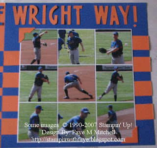
Warming Up the Wright Way!!!

Here is the next two pages for my baseball scrapbook. These pages were inspired from a layout I found online and since I had so many pages with David Wright warming up before the game in Cincinnati I needed to find a way to use the majority of them so I wouldn't have to actually pick a few of them. David Wright clearly is one of my favorite baseball players.

Recipe:
Pictures are 3x3 and there are 9 of them mated with Whisper White. I then used Only Orange & Brilliant Blue. I don't recall which Cricut cartridge I used to cut out the title but that's how I got the title and then used the photo corner punch by SU to punch out the photo corners that I put in just the 2 opposite corners on the two pages. I needed a little something for down the sides to spice up the pages so I took just pieces of paper that were 1 1/2 by 2 1/2 and put them down the sides to make the illusion of stripes.

Thursday, April 10, 2008

Go Reds --- Kinda Sorta, Not Really!!!

This is the 4th 2 page spread for my Cincinnati Game/Trip section of my baseball scrapbook. I'm on a roll and just can't seem to stop scrapbooking, however it will be placed in the 2nd spot in the section as far as order of pages goes. If that makes sense. Anyway... like I said I'm on a roll. I've set up a goal to scrapbook a single page a week so that I can get 52 pages done by the end of the year. Currently, I have 9 pages done and need to get 6 more done so I can be on track for my goal. This really shouldn't be that hard but we'll have to wait and see how it all goes. Even if I don't reach the goal it won't matter because at least I'll get quite a few pages done in the attempt at reaching the goal and I'll be proud with the final outcome of the scrapbook.

The journaling reads:
"Okay so the fact that Scott is wearing a NY Mets jersey in the picture makes the title a bit far fetched, but I thought I would at least give a small shout out to the home team. After all they lost badly & their fans were extremely outnumbered. It just doesn’t seem natural to me that the away team would have more fans in attendance then the home team. However, it didn’t seem to bother the Reds’ fans that much because they still were super nice to us, even though we were clearly cheering for the Mets."

Page Recipe:
Stamps: Sporting Goods
Paper: Real Red, Basic Black, Whisper White, Non-SU Vellum & Baseball DP
Ink: Basic Black
Accessories: Actual Tickets & Seating Chart, Photo Corner Punch, Cricut Cartridges -- Going Places & Basic Shapes & George, Glue Dots, Xryon Machine

Monday, March 31, 2008

First of Many Scrapbook Pages

This is the first of many scrapbook pages that I've done all on my own without casing someone else or having someone tell me what to do. I made this 2 page layout for my scrapbook I've recently started to work on. I'm going to make one with all my trips to baseball stadiums and probably will also include other family vacations in there as well. I've decided to call the book.... "Roadtrip Summers." It's sort of a play on the fact that I"m taking roadtrips in the stories and photos and the fact that the baseball teams are often on roadtrips as well. LOL.

The journaling reads:
"Who would have ever guessed that a week in NYC would lead to a trip to Cincinnati to see the NY Mets play the Cincinnati Reds over Labor Day weekend? Well it did and although the 5 hour trip actually took 6 because of the bumper-to-bumper traffic going into the city. It was more then worth the drive. The Reds have a beautiful stadium but the fact that it was 110 in the shade and there was no breeze to be found anywhere was a bit of a downer. In fact, I ended up getting sick and missed the last 2 complete inning of the game. Even after experiencing the evils of heat exhaustion, I still would make the trip again but maybe next time, I’ll check the forecast a bit better and remember the sunscreen and portable fan!!!"

RECIPE:
Stamps: Sporting Goods
Paper: Not Quite Navy, Real Red, Whisper White, DP Notations
Ink: Basic Black
Accessories: Circuit - Basic & George, 50 States, CM Oval Cutter
Difficulty (1-Easy 5-Advanced): 3

Friday, February 15, 2008

More Birthdays - August 2007

I made several of this card because I noticed most of my birthday cards in stock were more girly then masculine so I came up with this one. I thought it could work for both girls & boys but was definately more masculine. I also liked t he idea that it could very easily work for a Halloween Card. I guess that's what I get for using halloween themed designer paper but it's okay. I have alot of birthdays in October so the cards should go over really well.

Tuesday, January 8, 2008

Belated Argyle Birthday - August 2007

I made a couple of this card for some of my guy friend's who had birthdays earlier in the year that just slipped by without me noticing. This year seemed like it just flew by and that the more I thought about something the more likely I was to forget it once I was suppose to remember, which made this card and the saying absolutely perfect. I plan on making some more using this design but in more girly colors for some of my female friends.


CARD RECIPE:
Stamps: All Around Argyle, Linen
Paper: Sage Shadow, Chocolate Chip, Whisper White
Ink: Chocolate Chip, Sage Shadow
Accessories: Chocolate Grosgrain, Hardware, Gel Pen, Paper Piercer, Sponge

Monday, November 12, 2007

Alphabet Soup Birthdays - March 2007


I made several of these cards for upcoming birthdays. I love the Alphabet Soup and Alphabet Stew stamp sets. At the time I made these cards all I owned was Alphabet Soup, but since then I have also bought Alphabet Stew. I plan on making a lot more cards using these two sets in the near future. I also love the Au Chocolat Designer Paper SU had in the spring mini, and am terribly disappointed by the fact it didn't make it into the new 2007 Idea Book.


Recipe for Card 1:
Stamps: Alphabet Soup
Paper: Designer Papers - Au Chocolate & Loves Me, Cardstock - Whisper White, Cool Caribbean Ink: Close to Cocoa
Accessories: Pewter Hardware, Corner Rounder Punch, Chocolate Grosgrain Ribbon
Difficulty (1-Easy 5-Advanced): 2

Recipe for Card 2:
Stamps: Alphabet Soup
Paper: Designer Paper Pool Party, Garden Green, Brocade Blue, Sage Shadow
Ink: Brocade Blue
Accessories: Silver Brads, Square Brads(non-SU), Corner Rounder Punch, Ticket Corner Punch, Paper Piercer
Difficulty (1-Easy 5-Advanced): 2


Friday, March 16, 2007

Masculine Series II

While making the other boy card I also came up with this design that can be used for both boys and girls depending on the color combos. This combo definitely works better for boys I think though. I actually gave this card with the brown ribbon to my husband for his birthday. He said it was his favorite of the different combos. I like it because it's simple but sort of elegant in a manly way. I am going to definitely play with it some more to come up with some more color combos and different additions using some different pieces of hardware and possibly some other techniques. I learned the shaving cream technique the other night at the local demo meeting and I think it would work really nicely to make some different swirly designs similar to the background on this one. I am aware though that this one has some actual clear nautical shapes in it... those would be missing from the shaving cream technique but I still think I could come up with some really neat paper that way that would work for this series. Below are the other two card designs in this series so far.

Masculine Series I - Jan 07

I realized while making the Stripes & Flowers Series cards that I didn't really have any cards that would be truly acceptable by boys and men. So I started playing with the different stamps I had that weren't flowery or girly and came up with this card. It could definitely be made more flowery for girls but it works with these colors for boys and men. At this time there is only the one color combo and design for this card, but there will be more in the future as I've gotten some more stamps, ink colors, and paper.